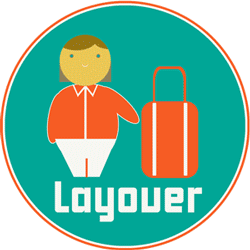
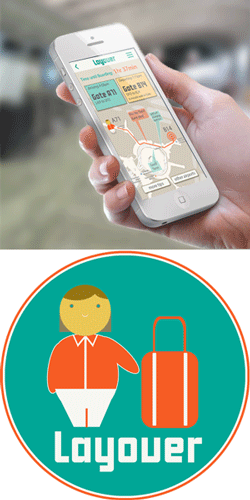
Vicky Knoop


Layover

Make layovers more enjoyable and less frustrating. 

Layover was a three day challenge to go from concept to prototype during an NYU UX design intensive. The idea came from finding a quiet hallway in Chichago O'Hare Terminal F that had tons of seating, plugs and good wifi. Why didn't I know about this earlier? Thus, the idea for layover was born. A app to find and share airport secrets that make layovers easier and maybe even enjoyable. Oh, and get you to the gate on time too. 

Download the full proposal PDF

Try the prototype: bit.ly/1w1qEVG


What I did:

Concept

UX

Design

Prototype


Features

Terminal    Maps

Terminal Maps

  Flight       Info

Flight Information

Boarding Pass

Boarding Passes

Airport     Tips 

User Tips

  Find        WiFi

Internet and Power

  Search Airports

Search


The features of the app focus on what an air traveler needs most during a layover, from when the plane touches down to the moment they get to their next seat. While many travel apps expand to the entire trip including hotels and booking, Layover focuses in on just getting one part of your trip right.

The most important goal is to get the user to the gate on time with a boarding pass in hand and have a chance at a nice break in between. 


Two Tap Maximum

If you're in the airport, you're in a hurry. All features on the app are accessible in no more than two taps from the home screen.


Ahhh... that's better

It's easy to get flustered in an airport, so the design uses colors and textures hint at that beach vacation you wish you were on.

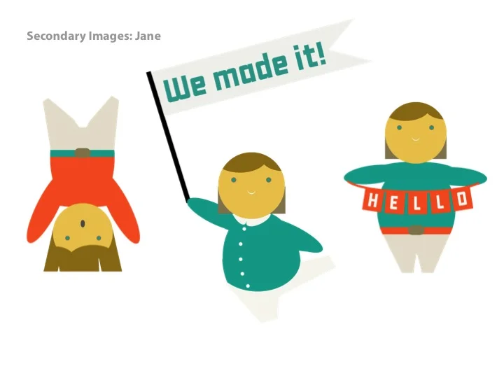
Jane, a character created as your adorable travel buddy, escorts you through the airport and the app speaks through her voice: friendly, organized and quirky. 


Who's going to use this anyway?

JANE

Casual but frequent flyer

Jane lands in San Francisco and knows she has a two hour layover. She turns on the app while the plane is taxiing and gets walking directions to her next gate, B14. It tells her it will take 10 minutes to walk there and there is a restaurant on the way that has $5 beer. She gives a thumbs up to the tip and adds that the spot has a strong wifi connection.


JOHN

International business traveler

John is traveling internationally and won't have data service during his layover. Since the app has his travel info, it prompts him to download maps for the Seoul airport the day before he takes off. He hits ok, and when he lands in Seoul he has the airport map and top tips. It also alerts him that there is an open wifi network he can use. He connects to wifi and receives updated flight information.

XAVIER

Content creator

Xavier often travels to Iceland, but Kevlavic International airport doesn’t have a terminal map on Layover. Noting this, he finds a map of the airport, uploads it and adds a few tips. Other users give Xavier’s map a thumbs up and editors take note. Xavier’s map becomes the standard map used for that airport.


Like No Other

The app store is filled with travel apps, but the market for an app designed specifically for layovers is relatively small. The closest is called Smart Layover. Smart Layover is limited by the small number of airports it covers (21) and the fact that it doesn't allow users to post the info they have for others. It's also focused on coupons and deals, and puts the users needs to the side. Layover keeps it's eye on the prize to get you to the gate on time and encourages users to add airports to reach every part of the globe.


Check out the PopApp Prototype:

 
layover_logo_final.png

Ewe Brew

User ExperienceDesign


Ewe Brew is a welcoming and informative expert.

The design uses a muted grey green color palette accentuated by lots of pops of red. The mix of vintage drawings and flat graphics give a nod to the hipsters but don't climb right on board. 

Ewe Brew was a planned community based fermentation and science center providing classes, workshops, and supplies to encourage experimentation and education. Unfortunately, after design, they never got into a space. 


Logo and variations

Typeface and Color

Visual Assets

Homepage Mockup

Mobile Mockup


Ewe Brew

Responsive Design


Ewe Brew is your after hours science teacher.

Through the lens of beer and brewcraft, Ewe Brew sneaks in the science that most of us forgot. The design is for a responsive site that fits to phone, tablet and desktop.

Ewe Brew was a planned community based fermentation and science center providing classes, workshops, and supplies to encourage experimentation and education.

What I did:

Design

Layout


Final wireframe

Sketch

Sitemap - click to view

Wireframes and Sitemap

The hierarchy of information highlights events/community first and keeps the sales section as a convenience. Ewe Brew is different from any brew supply store in that it's a place for education and classes more than a retailer. 


Homepage Mockups


Mobile Layout

  • Focus on location based needs and event information
  • Navigation as side drawer with menu icon
  • Top level search icon for finding information from events, forums or article
  • Break at 400px
 

Tablet Layout

  • Similar to desktop
  • Pulls recent events into a slider at the top of the page
  • Maintains hierarchy of desktop site
  • Maintains footer with additional navigation
  • Break at 1040px
 

Desktop Layout

  • Full screen version of site
  • Top content reoriented into columns.
  • Larger images and more events 
  • Additional scrolling space
ewebrew_homepage.png
 

Pulse

One Site, Every Device.


Devices that Fuel Design

This responsive website design for a fictional fashion company was was created as part of the NYU UX design intensive responding to the following creative brief: 

"Pulse is a high-end, minimalist fashion company integrating wearable technology. Pulse wants our customer to look sophisticated and futuristic, but still luxurious, and are looking for design decisions that reflect this marriage of technology and high fashion."

Download the full presentation PDF

Check out the responsive homepage mockup: bit.ly/1nXl4k2


What I did:

Wireframes

Layout 

Design


User Types


She Knows What She Likes

Seeker

A user heading to the site to check out the latest styles is greeted with a large splash image and graphic text to create a brand experience that emphasizes style and brand loyalty. Great photos and sleek design make users think "I want to be that girl."

Ms. Out and About

IRL Shopper

As soon as she hits the site on a mobile device, the shopper can easily find the store she's looking for and get in the door. Or if she's just killing time, she'll be able to browse the latest collections and make purchases before lunch arrives. Mobile focuses on location based needs first, and then makes it easy to start browsing. 


Bedtime Browser

Relaxed Browser

Reclining in the evening, our user taps through to the site and is encouraged to sign in. Wanting to have the full experience, she logs into her account and  can makes one tap purchases on a whim. 

Lap Lounger

Everyday User

The laptop version of the site scales everything down  and creates faster access to hot new looks without losing the full screen experience. 


Logo Design:

The Tech Halo   

Shifting your eyes from the world around you to your Google Glass and back again creates a moment where the world is a hazy film strip. Combining this concept with a dark cool aesthetic creates the moody, sophisticated look of high fashion for the young elite. 


View the responsive prototype: bit.ly/1nXl4k2

pulse_multi.png
 

Shell Out or Shame

User Research and Competitive Analysis


Put your ego on the line.

Shell Out or Shame helps people stay on track with their personal and collective goals through wagers and ultimatums between friends. Wagers can be donations to charities or friendly measures of hubris such as posting an embarrassing photo or story to social media.

This project focused on primary user research and competitive analysis as part of a group project through the NYU Center for Advanced Digital Applications.


Download full presentation and analysis

What I did:

User Stories

Competitive Analysis

Survey

Logo Design


How are we different?

With several similar apps and websites on the market of making wagers to attain personal goals, we took a look at the four biggest competitors to see what they are missing. 


What they missed...

  • Competition with friends 

  • Ease of use

  • Social motivation including embarrassing pictures or stories


Survey

What motivates people to improve themselves? Is money enough? If so, how much? Is personal embarrassment too far? We wanted to know, so created an online survey to find out. 


Methodology

  • Online survey using SurveyMonkey
  • Promoted through Facebook and email
  • Open July 18, 2014 – July 21, 2014
  • 8 questions
  • 73 respondents

Results

Potential users are motivated by money but would also be motivated by social embarrassment. They select the technology and apps they use mostly based on other people's reviews. 


Survey Results By the Numbers


ss_graphs.gif

Urban Bazaar

Ewebrew

Layover

Pulse

Screen Shot 2015-04-29 at 9.25.02 AM.png