
San Francisco
Arts Commission:
Site Redesign
My Role: UX Designer + Project Lead
The Arts Commission is the City department that promotes the arts through grants, galleries, public art and artist resources. As the design and technology manager, I oversaw projects that aimed to unite the disparate arts programs. One of the biggest hurdles was to merge all of the sites into a consistent brand with a clean navigation and easy access to artist opportunities.
1 Organization, 8 Sites
Each of the eight arts programs within the agency had it's own website and branding that was managed by associates and interns in each of the groups. With limited support and funding for each, many were poorly maintained and out of date leading to funds for artists going only to those that knew how to navigate the complex system. By creating a great and easy experience for artists we’d reach a larger community and make the opportunities accessible to all.


Mend and Merge
The first step to creating a single web presence was to catalog all of the content on the sites and take a hard look at the architecture. Simultaneously, we engaged with a branding company to create a single logo with variations for each of the programs.
SFAC Sitemap
How We Did It
Step 1: Match it Up
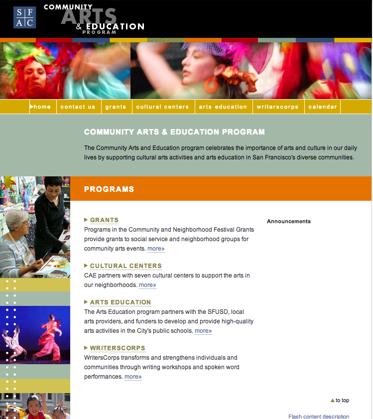
The first step was to templatize the sites into a consistent look and feel and into one CMS system. The template was designed to scale for each programs needs yet maintain a connection to the other programs. While many programs still had a stand alone site, the navigation style, branding and identity were in line and laddered up to the vision of a unified presence. Smaller programs were brought under the agency homepage design a style guide ensured a consistent visual language and the tone for future projects.
The Public Art homepage after rebranding
Community Investments homepage after rebranding
Step 2: One Logo To Rule Them All
Soon after, we went through a rebranding process to create one logo to be adopted by all of the programs and a modernized color palette and font set. The rebranding was provided pro bono by Studio 1500.
Step 3: Under my Umbrella
With all of the design assets in place, we were able to direct attention towards a full site redesign. While the budget was limited, we came up with a solution that fixed the overall navigation between programs and resources, reorganized the information architecture and automatically brought program information to the homepage. The umbrella site solution pulled everything great that the programs had to offer up front and easily accessible making it clear that we were one agency.
The Final Result
After the launch of the new site, we saw an increase in grant applications from new artists and had cost savings from maintaining multiple websites.