Strategy and Design
Facebook Portal Redesign
Role: Punchcut Design Director
Punchcut Team: 7 Designers; Project Manager
Meta Team: 3 Designers + Stakeholders
Timeline: 18 Weeks - 2022

The Opportunity
Reimagine Portal as the OS for all of your relationships.
Goals
Facebook partnered with Punchcut to reinvent the OS for the Portal device to bring together all of the products in the Facebook family. The initiative leveraged Portal’s hardware as a starting point, but aimed to build an operating system akin to iOS or Android that was portable across devices with your relationships at its core.
Bring the Meta family of apps together in one seamless ecosystem
Create a UX and identity that is uniquely Portal
Reinvent Portal as the Relationship Platform
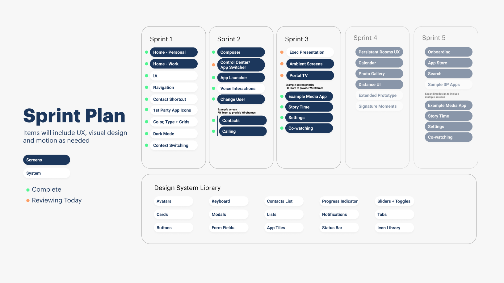
Keeping a Team on Mission
The team included over 10 designers across multiple disciplines, along with several project managers and stakeholders. Leading such a large team on a single project required strong organization. I implemented a sprint planning methodology to time-box feature design and paired designers strategically to divide work and maintain momentum.

Defining the new experience
The Relationship Platform
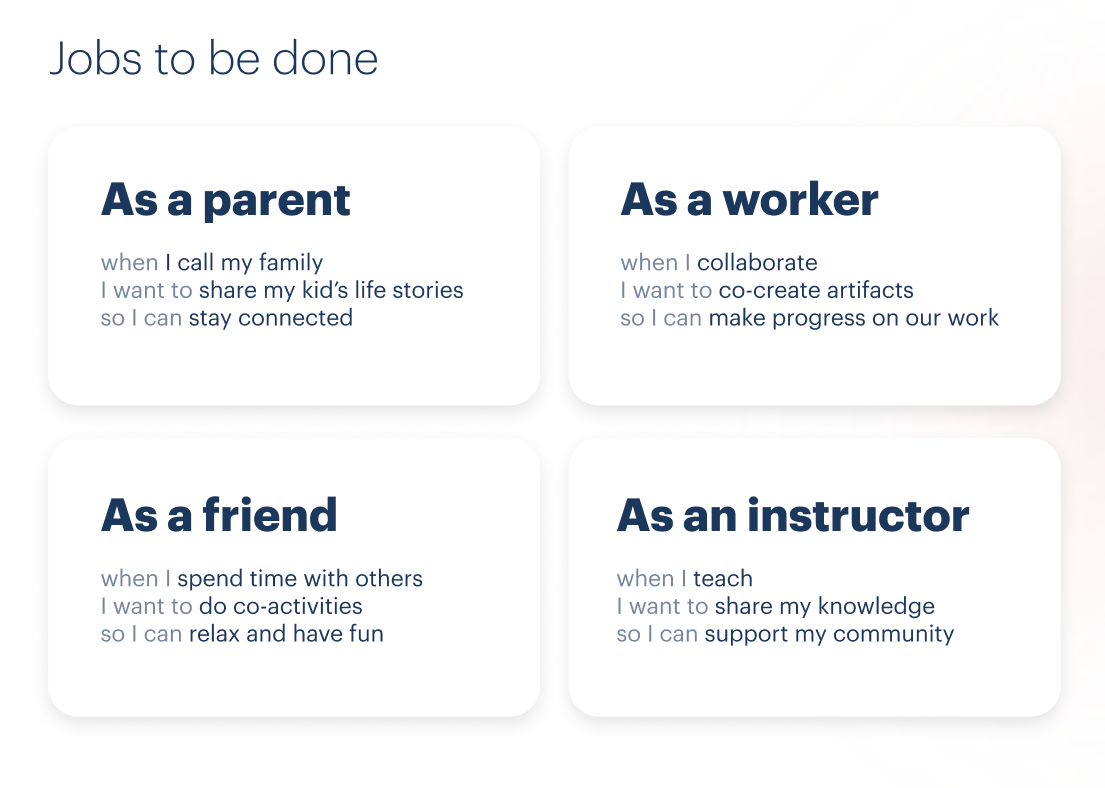
Defining User Needs
We applied a Jobs to be Done methodology to understand the key roles Portal could play in a person’s life. Shifting away from traditional personas allowed us to explore how the device could support the many different hats a person wears throughout their day.
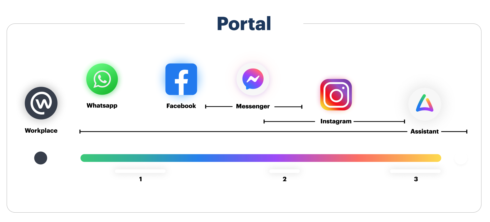
A family of Colors
Visual Language
The team examined the existing product family and its position within a broader spectrum to establish a cohesive color system that unifies all communication platforms.
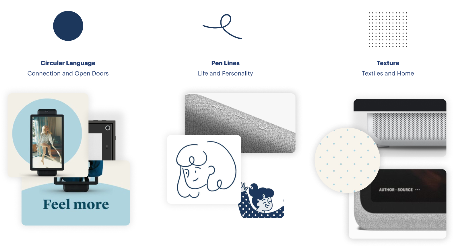
Shape, line and texture
To define the shape language, we explored how Portal’s hardware and branding could inform a cohesive and unified experience.

The Big Moves
Gradients provided the visual foundation, while the shape language and motion design worked together to establish a cohesive system. Motion wasn’t just decorative—it reinforced hierarchy, guided attention, and brought the experience to life across surfaces.


Interaction Design
Designing Near and Far
The interaction design needed to function on two levels: casual, across-the-room use and close-up, task-focused engagement. Portal had to support both modes seamlessly. While touch controls and distance-based navigation followed the same core patterns, each required distinct considerations to accommodate differing contexts and user needs.
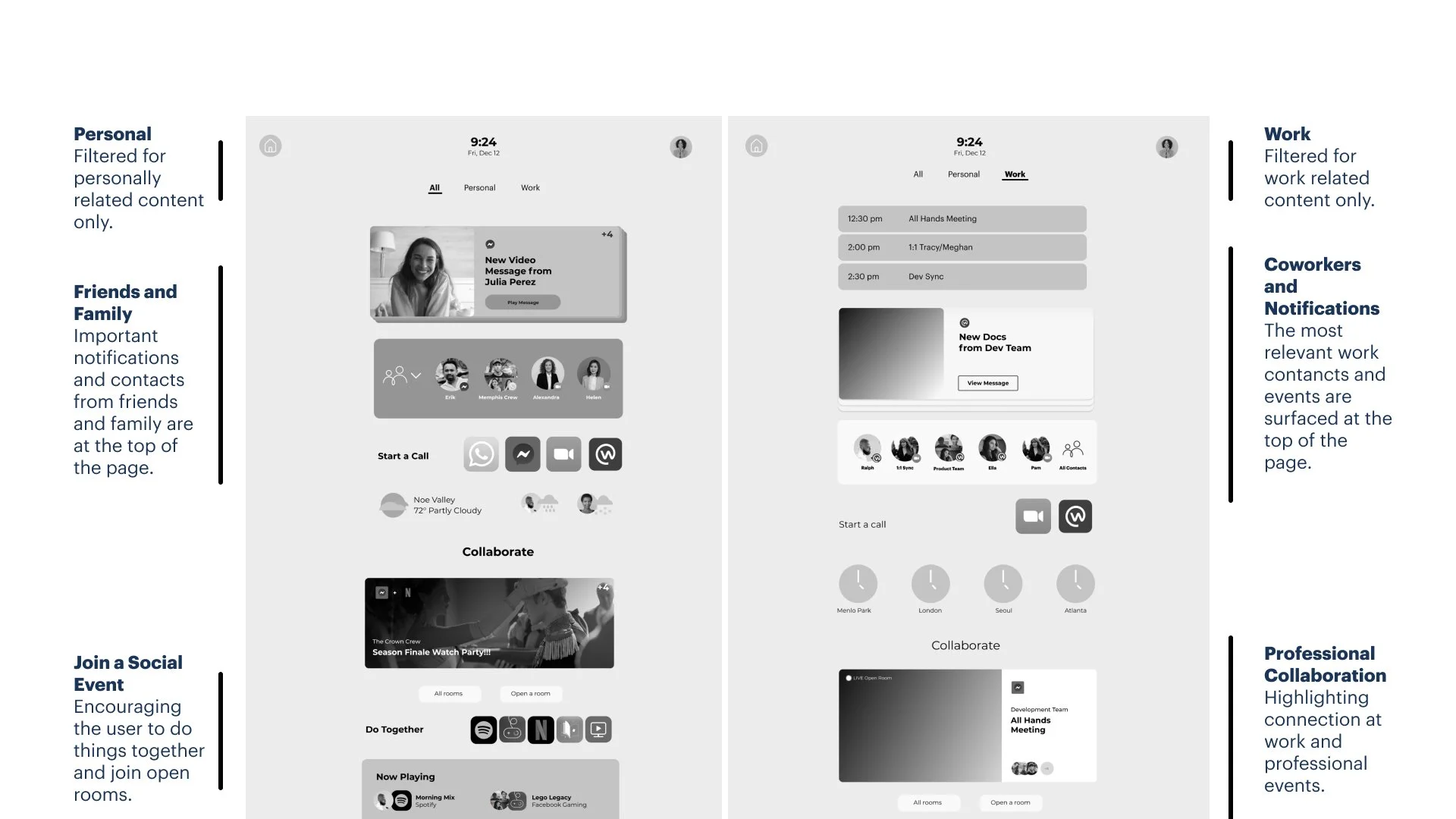
Wireframing and Content Hierarchy for Home
Balancing personal and work contexts was a priority based on the JTBD and current user behavior. We created a mode switch capability that would allow someone to quickly jump between contexts with a different hierarchy.
Prototyping and Development
How it Comes Together
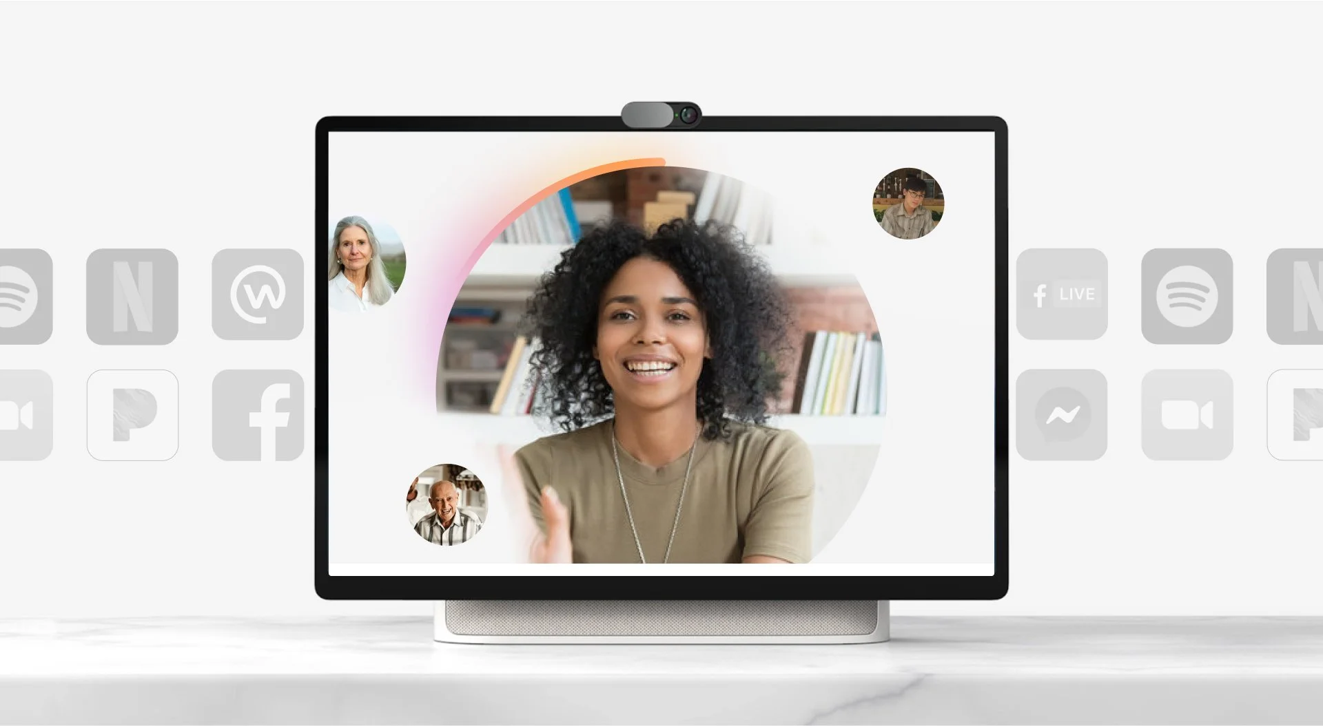
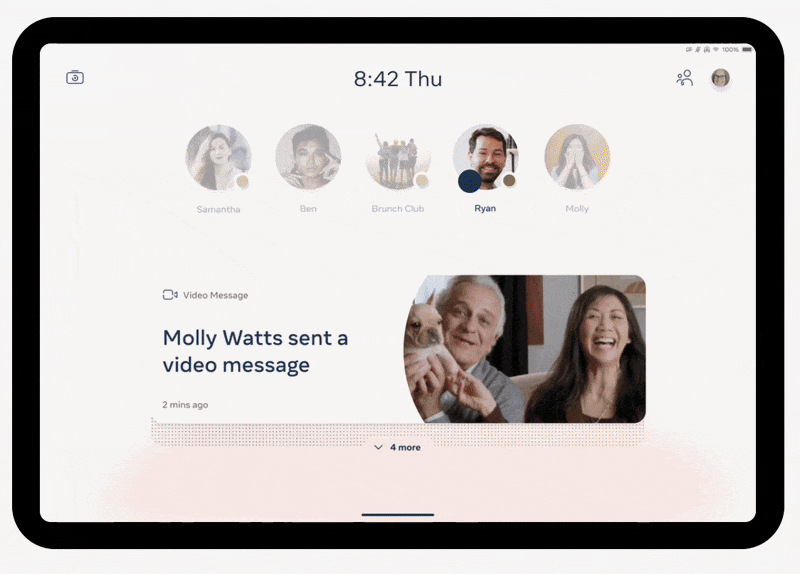
Video Messages
Watch Together

All your apps in One place
Outcomes
What Happened Next…
After a great reception from leadership on the new design, the Portal Device was discontinued in November of 2022 before the new OS could be fully released. However, what we designed was presented to internal groups working on the Meta branding. Our main stakeholders said it was used as inspiration, so work always lives on in new ways.